Magazine walls have been my favorite way to spice up any free wall space in my bedroom. Not only is it a great way to add color, but they only cost a couple of dollars and no more than an hour to create. They can be made with about any digital prints you have laying around like pages torn out of a vintage edition of Vanity Fair, ads from this month’s Elle Magazine, or even editorial shots out of National Geographic depending on your interests. It can be whatever you make of it and tailored to what you love in life 😋. Here are three of the most important guidelines I like to follow when creating a magazine wall that’s impactful, consistent, and something that’s hard to grow bored of.
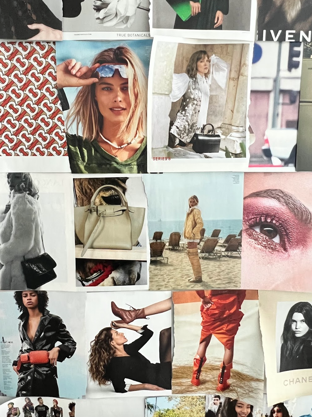
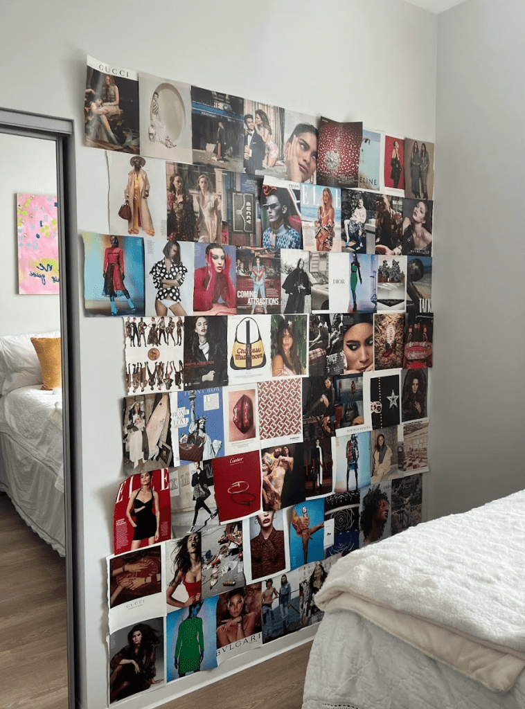
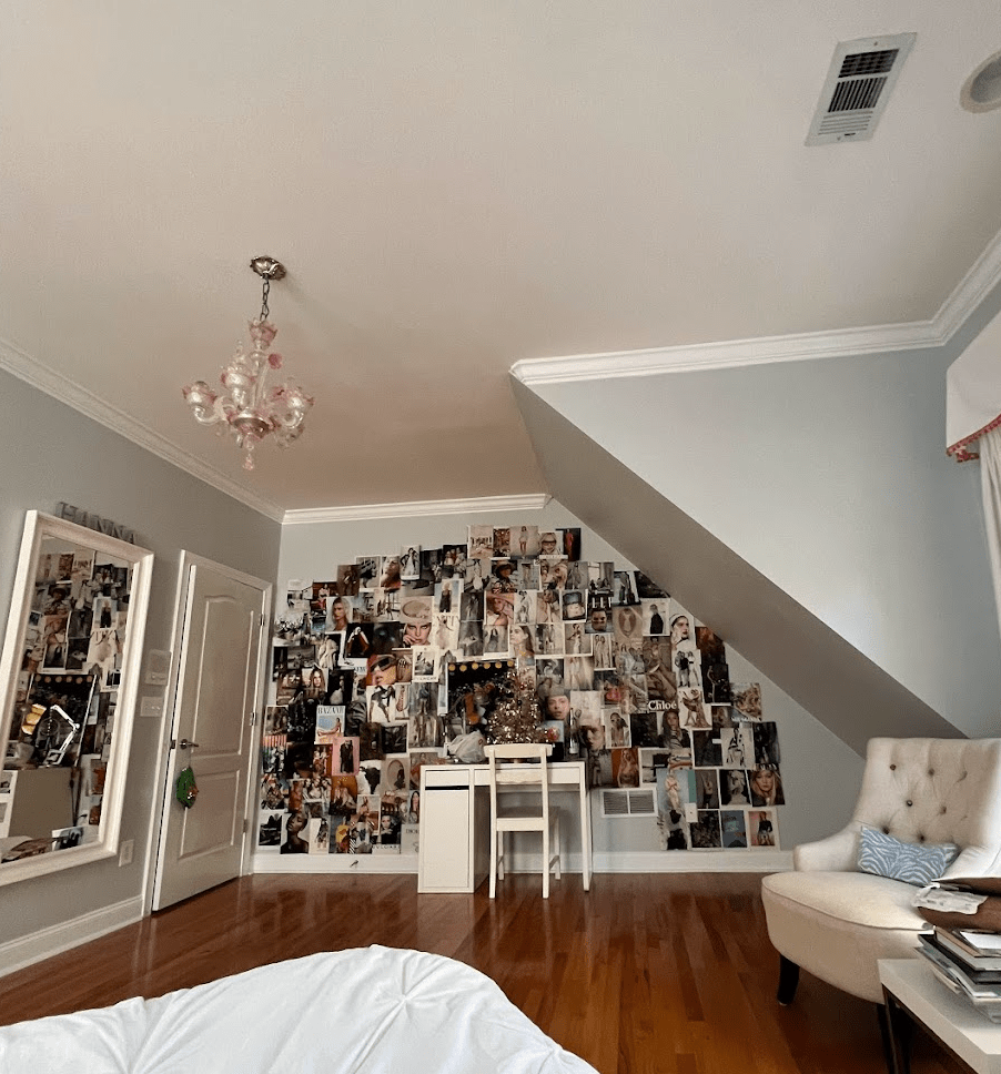
1. Come up with a layout theme and stick with it. I find that whenever I make a magazine wall I tend to attach a specific overarching ‘vibe’ to it so that it’s easier to weed out photo options that are a good but not necessarily a great fit. In the first magazine wall I made for my apartment room, I wanted it to look very “girly” with a high-fashion twist, hence all of the brand advertisements and pinks that can be found throughout. Another tactic I like to use is literally coming up with how I want to lay the photos out. In the one I made for my childhood bedroom I took a more organic approach by having the photos emanate from the center, whereas the two I’ve made in my apartment have been arranged in rows so it has more structure. All in all, having a purpose steers the magazine wall in a specific but not unyielding direction that helps to eventually add cohesion by adding clarity to what images are necessary.
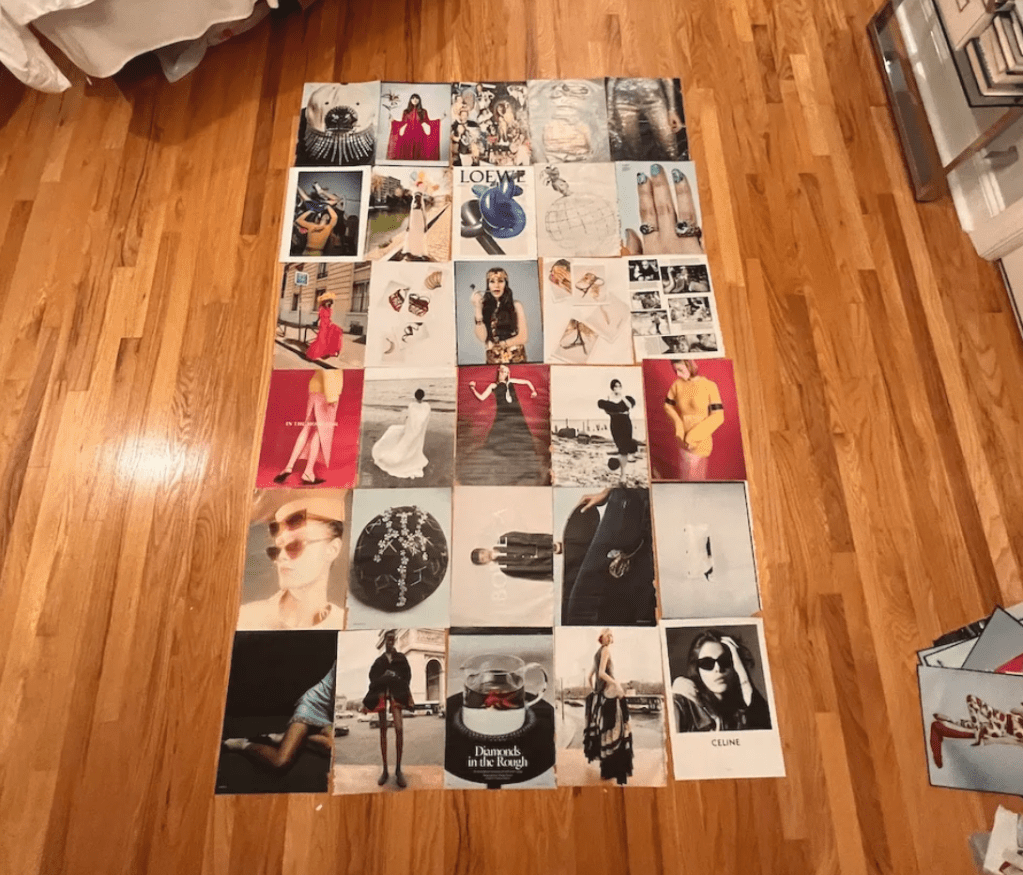
2. Spread out your favorite pages. Chances are your absolute favorite images that you’ve selected come from either the same multi-page editorials or ad campaigns from the same brand. To promote flow among the images, I like to shuffle them depending on the amount of structure I plan on arranging them on the wall. For example, to add variety to the images I pulled for my childhood bedroom, I randomly shuffled them since I went for a more organic layout. For my apartment, I’ve developed the strategy of having one bold accent color per row that can be skipped and re-incorporated between rows. This has also enabled overall coherence with the whole wall even if the rows don’t seem like they serve a larger purpose individually.
3. Make sure to use enough adhesive. The most aggravating part about this type of decor surprisingly isn’t the installation process but the maintenance. Be sure to also use tape that has the right balance of stickiness and ease of removal (I’ve found that Scotch Magic Tape does the trick). To properly secure images to the wall, I like to horizontally place a large length (~ 1 in.) of the Scotch tape across the top and bottom of the image and eventually attach its corners to the surrounding pages.
Aside from being a great decorative piece, I also love magazine walls for how well of a tool they are for visualization. Looking at the wall the first thing before going to bed and after waking up re-orients my mind for what I want my future to be like regardless of how my present circumstances look. Especially when school work gets tough, looking over at the wall provides me with inspiration to push through and work to get closer to my dreams.
All in all, magazine walls are my go-to room decor method because of how easy they are to create and reflect each person’s individual style. I hope you enjoyed it and I would love to hear if you have any tips and tricks for making magazine decor! Wishing you a great week ahead <3.

💘 Hanna

Leave a comment